Home / Ariat.com / Filter Redesign
Ariat.com Filter redesign
With the increased traffic coming to Ariat.com, it was time to give the filters some attention. The filters project was a quick, 3 month project to implement prior to holiday season so we can give the highest traffic of the year, the best possible experience. Our previous filters experience offloaded every single filter within a category without any structure or hierarchy. With the filter redesign, we had to look at site structure and how we ultimately wanted to portray ourselves to the customer, as well as find out what’s important to a customer when shopping on Ariat.com. After going through extensive research and design phases, we began a category level implementation that allowed the customer to shop how they want, from wherever they want, with the idea that having all the shopping accessible on each product listing page would increase average order value per customer. Ariat customers have a tendency to shop multiple categories, so having accessibility to these is of upmost importance.
What was I trying to solve?
The pre-existing filters were clunky and didn’t allow customer to select multiple filters at a time
Each time customer would select an attribute from a filter, the filter would close which would force the customer to have to re-click on the filter and apply another one if they wanted to filter down further
Allow products to be shopped across all segments on a PLP level without disrupting the experience
Old experience would take them to a subcategory PLP which would confuse the customer and the other categories that were available disappeared
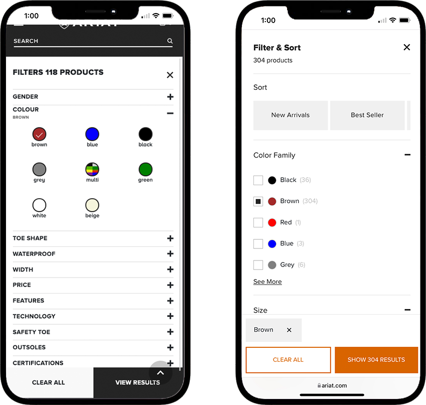
Improve sizing filters to display the sizes available for easier access by the customer
Improve pricing filter by incorporating a price slider versus checkboxes
Declutter the overall filter experience so if an individual filter has more than five filter attributes, a “See More” link is displayed, and the top five filters utilized by the customer will be set to display by default
Display selected filters in a clearer way
Customer & Competitor Research: Research Document
After doing some research on our customers quantitative usage, as well as user testing to get qualitative feedback, I was able to compile some major pain points that needed to be addressed in the redesign.
Need more search buttons or categories to sort things easier or make them more visible and easy to see.
User got lost and missed the categories text menu entirely.
Understands what categories are for but doesn’t know what the differences between each category are when just viewing the text.
Would like the usability to be easier and more simplified.
Got lost between categories and couldn’t find his way back to the previous page he was on. Would like to have categories included as a feature under filters on all PLPs so if the user gets lost, they can find their way back.
This user tried to go to the filters to find the categories but they aren’t included in that section
Would like to have categories included in the filters at all PLP levels. User clicked out of experience and got lost and couldn't find the categories.
She clicked to a category but didn't know how to view categories again. Couldn't undo the category view. Include in filters on all PLP? Include Breadcrumbs? It's difficult to get off category page once she's on it.
Categories are like filters but got confused with the difference between categories and filters. Wonders what's in the categories but has a faint idea of what they're for.
Likes the ability to filter and sort. Not easy to navigate amongst the categories/filters/sort buttons.
Filters got lost beneath the categories.
MEASUREMENT OF SUCESS:
Significant reduction of customer service calls for customers looking for product and not being able to find it.
Wait time reduced from 24 to 48 hours down to 60 minutes
12.47% increase in filter engagement year-over-year
45.93% increase in revenue year-over-year
30.04% increase in conversion year-over-year
Functionality & Recommendations:
Mobile first strategy
Allow customers to select more than one filter at a time so they can refine their shopping experience quicker
Do not force the filter to close after selection, allow the customer to engage with the filter as long as necessary for them to select attributes
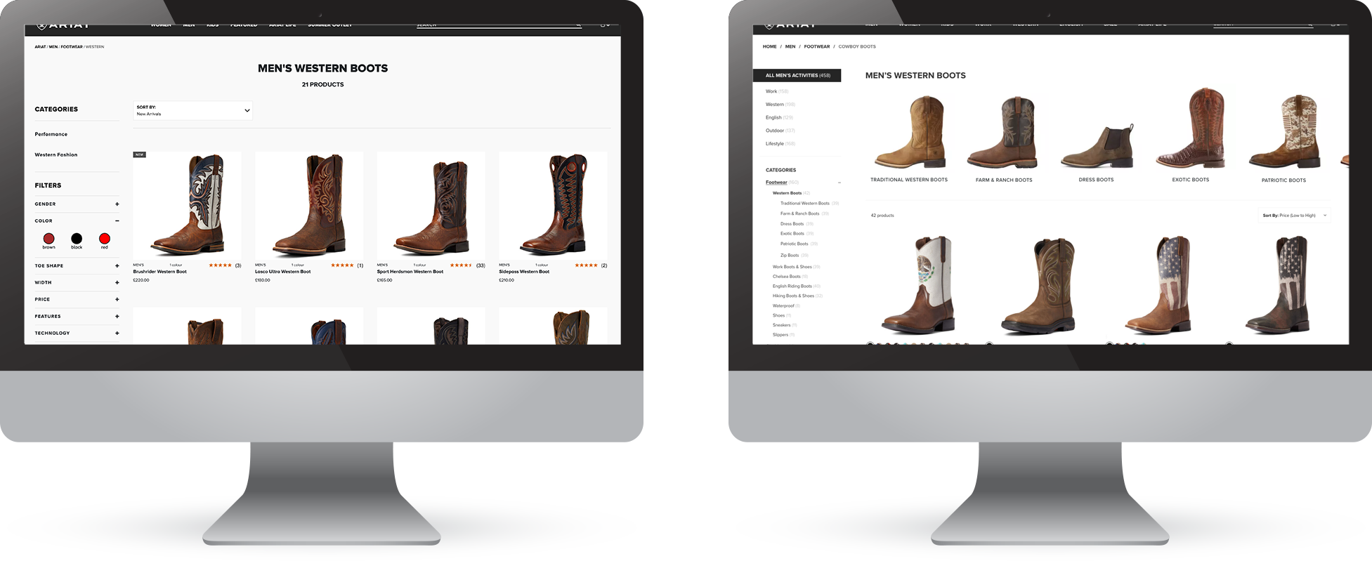
Incorporate categories at each level of the shopping experience so the customer can switch between categories easier and doesn’t force the user into another PLP layer where they don’t know how to go back
Have the top three most used filters auto expanded for easy customer engagement: Size attributes, color, and pricing
Include a “See More” link when a filter has more than five attributes
Incorporate filter hierarchy so the filters are displayed in order of importance to the customer
Display filters that have been selected by the customer in a clear way
Incorporate a product count next to the categories so a customer can know what to expect on a high level
Dynamic filters based upon where the customer is at in their shopping journey
Combine Filter & Sort versus separating them (old experience)
New user experience for subcategories that gets consumers into the products they want faster


