Ariat.com PDP Redesign
Home / Ariat.com / PDP Redesign
Ariat.com pdp redesign
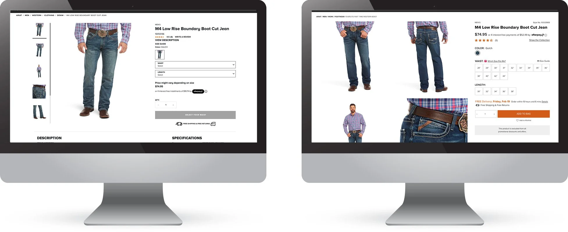
My first project with Ariat.com was to tackle the PDP redesign. The existing PDP was not performing as well as it could’ve been, so ultimately I wanted to improve the experience while increasing engagement, average order value, and conversion.
What was I trying to solve?
Better usability on PDP and checkout process
Higher customer conversion
Smart cross selling functionality
Adding more information about the products (fit, industry, material, etc.)
Modernizing the overall look and feel of the PDP and checkout process
Reducing overall page load time
Research: Competitor Research & Content Analysis Document
After doing extensive research on both competitors and non-competitors to get a baseline of what needed to happen in order to increase usability and conversion of the site, I identified some key takeaways of what must be included, at a minimum, in the redesign of the PDP.
Keep product name, price, AfterPay, product rating and at least ⅓ of product image above fold
Include visual representation of how many product images are in the carousel (ellipses were used across the board and were also clickable to jump to photos toward the end of the carousel)
Set up designs utilizing sticky add to cart and in-line add to cart CTAs (test to find the preferred method)
Include as much detail regarding product as possible and organize it in consumable bites (separate tabs, swiping through features, etc)
Redesign the layout and interface of reviews to have it streamline more with the site and our styleguides
Be transparent! - product not eligible for discount, limited or low stock, “selling fast” - to give information as well as urgency messages
User Testing: User Testing Report
After I pulled together all my research and socialized my research and recommendations with the stakeholders within the company, I began to wireframe out the experience and start to incorporate the design elements. I worked with cross-functional teams to make sure each use-case was accounted for and put the experience through user-testing to make sure we were launching the correct user experience. Overall observations after conducting user testing were as follows:
Users find pricing and reviews to be the most important
Content was very informative but certain terms should be defined further (example: TPE heel, 4LR™ Technology, etc.)
Currently there are too few reviews regarding sizing so implementing a “Size Predictor” function would help the products that don’t have a lot of reviews
Products with few reviews (positive or negative) don’t invoke a lot of confidence in the customer. Think about emailing past customers to receive a non-biased review on the product they purchased.
Users immediately knew how to interact with the accordion and swiping functionalities
Liked that the important information was elevated at the top of the page and all content was easy to read through or to skip to whatever section was important to them, such as more info regarding Shipping & Returns.
Customers liked being able to see all the sizes available without having to interact with a drop down menu
Customers like to know when a product is excluded from a promo because many customers are promo-driven to purchase.
measurement of success:
Measured a year-over-year increase in conversion by 12.89%,
Year-over-year increase in revenue by 47.47%.
Functionality:
Increase usability of page by breaking out content so customer can get to product information more efficiently
Include more product focused descriptions, as well as fit guides
Increase visual references by incorporating a 2-up product image approach


